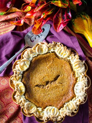
/*
Welcome to Custom CSS!

To learn how this works, see https://wp.me/PEmnE-Bt
*/
.site-title a {
    background-position: center !important;
}
.header-image .site-title>a {
    height: 200px !important;
}
.site-title {
    margin: 0px 0 !important;
}
.header-image .title-area {
    padding: 0 !important;
}

.widget_top-posts .widgets-list-layout li > a {
	width: 40%;
}

.widget_top-posts .widgets-list-layout img.widgets-list-layout-blavatar {
	max-width: 240px;
	width: 100%;
}

.widget_top-posts .widgets-list-layout div.widgets-list-layout-links {
	max-width: 100%;
	width: 55%;
}

@media only screen and (max-width: 1019px) {
	.widget_top-posts ul.widgets-list-layout {
		max-width: 600px;
		margin: 0 auto;
	}
	
	.widget_top-posts .widgets-list-layout div.widgets-list-layout-links {
		font-size: 24px;
	}
}

.adjacent-entry-pagination {
	  margin-top: 30px;
    border-top: 1px solid #eee;
    padding: 20px 0;
    border-bottom: 1px solid #eee;
}
.mobilesearch {display:none;
}
.desktopsearch {display:initial;
}
@media screen and (max-width: 539px) {
	.header-image .site-title>a {
    height: 168px;
		max-height: 168px;
	}
.mobilesearch {display:initial !important;
}
.desktopsearch {display:none !important;
}

.site-title {
    margin: 0;
}

.brunch-pro .site-header {
    max-height: 200px;
}
}

.nav-primary input[type="search"] {
    padding: 9px 20px;
}

.nav-primary .search-form input[type="submit"] {
    padding: 9px 20px 10px;
}

.nav-primary .search-form input:hover[type="submit"], .nav-primary .search-form input:focus[type="submit"] {
	box-shadow: none;
	border: 1px solid #eee;
	width: 38.2%;
	font-weight: bold;
}

.nav-primary .search-form input:hover[type="submit"] {
     padding: 9px 20px 10px;
}

.nav-primary .search-form input:focus[type="submit"] {
     padding: 8px 20px 9px;
}
.home-top img, .gallery img {
	min-height: 0;
	min-width: 0;
}

.home-top .simple-grid a {
	height: auto !important ;
}

/*
	CSS Migrated from Jetpack:
*/

/*
Welcome to Custom CSS!

To learn how this works, see https://wp.me/PEmnE-Bt
*/
.widget_top-posts .widgets-list-layout li > a {
	width: 40%;
}

.widget_top-posts .widgets-list-layout img.widgets-list-layout-blavatar {
	max-width: 240px;
	width: 100%;
}

.widget_top-posts .widgets-list-layout div.widgets-list-layout-links {
	max-width: 100%;
	width: 55%;
}

@media only screen and (max-width: 1019px) {
	.widget_top-posts ul.widgets-list-layout {
		max-width: 600px;
		margin: 0 auto;
	}
	
	.widget_top-posts .widgets-list-layout div.widgets-list-layout-links {
		font-size: 24px;
	}
}